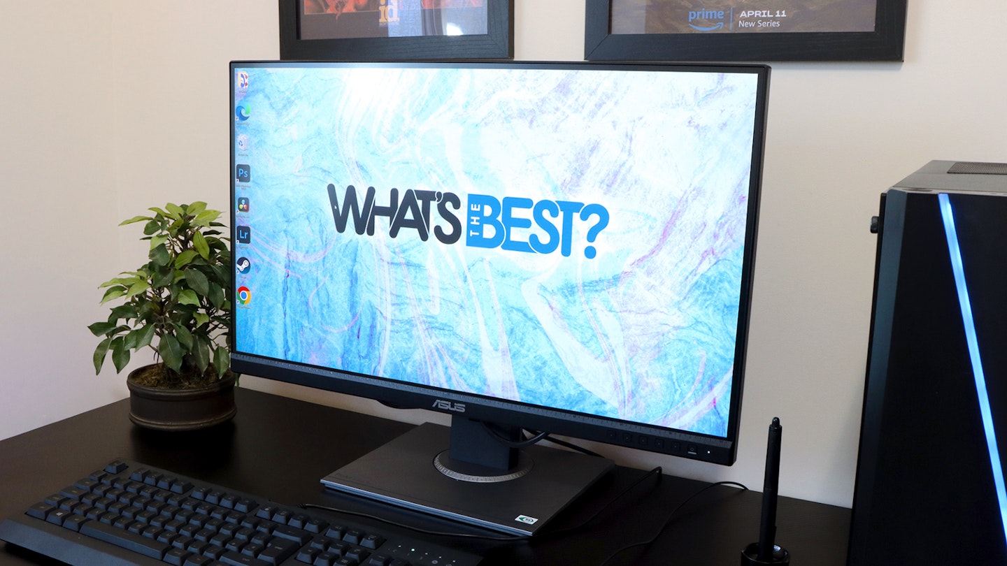
The What’s The Best team certainly has its share of creative types, so when we got the chance to put an ASUS ProArt Display PA278QV monitor to the test, we hoped it would be one of the best monitors for design, photographic and video work. At 27 inches and with a Quad-HD IPS panel, it may be the perfect addition to any home or creative studio. Yes, you’ll find monitors well over 30 inches, but they can be overbearing to sit close to – even more so in a dual monitor setup. Placing two of these ASUS ProArt monitors together, on the other hand, is a great fit for the desktops of most creatives.
So, what’s the big deal here? After all, 27-inch monitors are hardly anything new. Well, ASUS are all about colour accuracy and Calman certification. Unlike most standard home or office monitors, this brand aims the PA278QV at those who seriously care about colour. Aside from reliable brightness, contrast and overall image clarity, any designer or photographer (professional or novice) needs to know that they can trust what they’re looking at.
Our writer, Chris Duffill, has a working background in design, photography and videography. Let’s see what he made of the ASUS ProArt Display PA278QV – was it true to the eye or did he resort to colourful language?
Pros
- Stunning 100% sRGB and Rec. 709 colour accuracy with ΔE < 2, and Calman Verified for precise colour reproduction
- Built-in features that help creatives depending on what they need to work on
- Lots of flexibility with the stand and mount, including portrait mode
Cons
- The audio input and output jacks are in a fiddly location
| Resolution | 2560 x 1440 (QHD) |
| Screen size | 27-inch |
| Screen type | IPS |
| Refresh rate | 75Hz |
| Response time | 5ms |
| HDR | No |
| Ports | DisplayPort 1.2 x 1, Mini DisplayPort x 1, HDMI(v1.4) x 1, Dual-Link DVI x 1. USB Hub: 4x USB 3.2 Gen 1 Type-A. Earphone Jack. PC Audio Input. |
| Colour support | 100% sRGB and Rec. 709 colour accuracy with ΔE < 2, Calman Verified |
| Brightness | 350 nits |
| Viewing angle | 178° horizontal / 178° vertical |
Making a big splash of (accurate) colour?
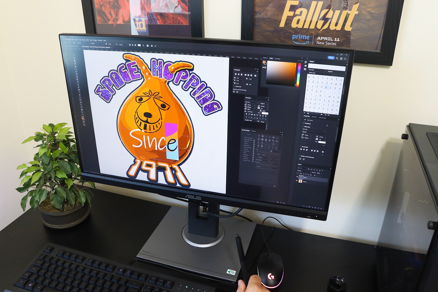
Now and again, I love the chance to pop back in time to when I was a graphic designer and video producer. I’m still a keen photographer, using Illustrator and Photoshop for my projects. My current dual monitor setup uses a pair of AOC 31.5-inch screens. They’re good, but spec-wise, they’re not quite up to the professional standard of the ASUS ProArt PA278QV. Short of investing in a professional calibration tool, I’ve done my best to get accurate levels with them, but I always know that things aren’t quite perfect.
I love a screen that claims to deliver 100 per cent of the sRGB and Rec. 709 colour space, but with the addition of Calman Verification right out of the box, I expected the ASUS ProArt Display PA278QV to impress seriously. I couldn’t wait to see how my designs, photos and videos would look on it. So, I began by opening some of my old and current projects.
Designing for digital
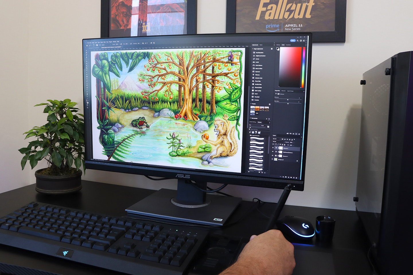
I like to work in the sRGB colour space for digital, partly because with a properly calibrated monitor you’re free to design whatever you like and know it won’t change later. I loaded my work into Photoshop and used my Wacom tablet to get drawing.
I found the display of the ASUS ProArt Display PA278QV to be refreshingly clear and precise to use, and a real step-up from my AOC screens. Whites were neutral white and black levels were deep enough to avoid noticing any bleed from the IPS panel. Colours, though, were exceptionally nuanced compared with what I’m used to – again reflecting the excellent Calman Verification of this monitor.
Designing for print
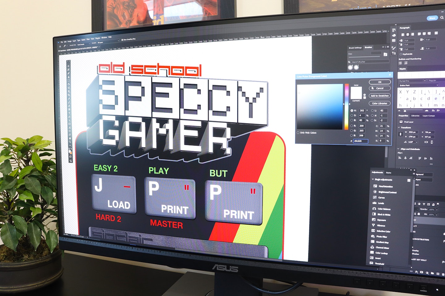
I design artwork for printing onto t-shirts, cushions and other textiles, so this allowed me to see how well the ASUS ProArt PA278QV represented the colours I was aiming for. This was a real eye-opener, as some of the colours I thought I had used when I designed them on my other machine looked markedly different on this more accurate screen.
I noticed the biggest difference when designing in CMYK mode. Given that the palette here is restricted to what ink can achieve, I’m used to seeing RGB work reduced to much duller tones when converted to CMYK. Yes, it’s going to happen anyway – but here, the ASUS ProArt’s rendition of those colours seems a little more vibrant than usual. They did look a lot more like how one of my final projects (a cushion) turned out.
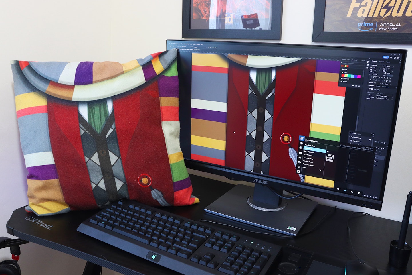
Photo and video editing

I opened some RAW stills taken with my Canon DSLR. Using Lightroom to apply profiles and tweak them was reassuringly precise. I also used DaVinci Resolve to grade and edit some footage converted from C-log to the Rec. 709 space.
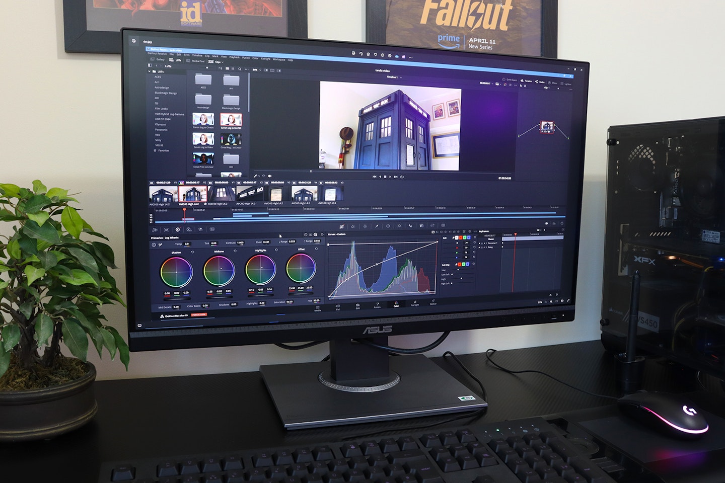
With both video and photo editing, I’ve always found adjusting contrast levels and subtle colour corrections to leave me at the mercy of the monitor I'm working on to some degree – this is precisely when you need a monitor that represents things with accuracy. And the ASUS didn’t disappoint. Having shot the material myself, I remembered how it looked in real life and was able to replicate it, also pushing levels here and there, without feeling like I was fighting the limitations of the display.
Useful extras
Colourful credentials
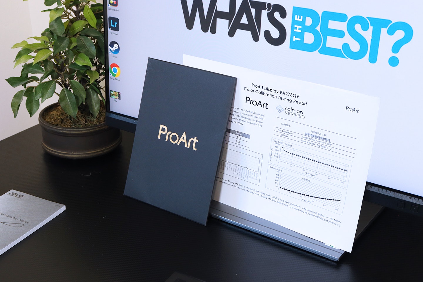
Unlike the AOC CQ27G2SE curved monitor I reviewed recently, this has an IPS panel – traditionally the better option for colour reproduction than other monitor panel types. Plus, each and every monitor that carries Calman Verified certification has been rigorously tested at the factory for colour accuracy. Also known as Delta-E (∆E), this monitor claims to have ‘∆E < 2’ across each of the monitor’s industry-standard colour gamuts. That means that any differences in colours being displayed are almost imperceptible to the human eye.
ProArt Presets
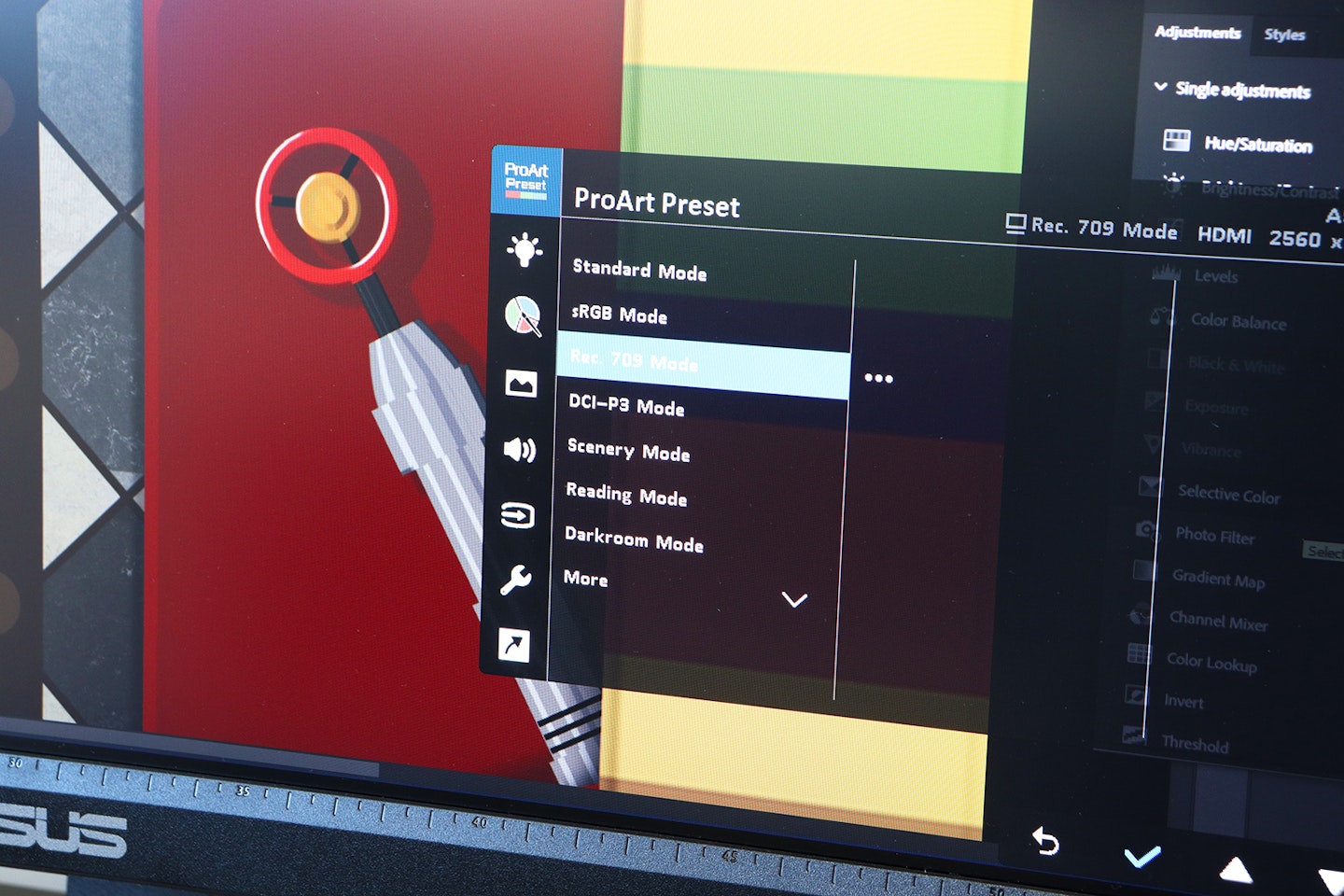
For me, one of the big draws of this monitor is the ProArt Presets. The monitor comes with multiple ProArt Presets that quickly change the monitor's settings to suit your content, allowing for even more accurate adjustments. For instance, switch the default sRGB preset to the Rec. 709 or DCI-P3 preset when editing video to match the gamut of your footage. For those who like to tweak things to suit, there are two user-defined presets, too.
Colour space aside, the other presets are more traditional, quality-of-life shortcuts that make reading or working in a darkroom environment more comfortable while retaining the accuracy you need.
Buttons, Menus and setup
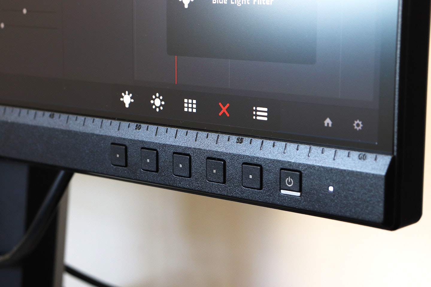
I have a real dislike for buttons recessed under or behind the bezel. Thankfully, all of the buttons are front-mounted. ASUS know that creatives will want to switch between Presets or make adjustments to suit their workflow. Also, two of the buttons are handy programmable shortcuts. I found the on-screen display to be clearly presented and easy to navigate compared to some others.
Looking at the overall design for a moment, I find it to be suitably refined and neutral – ideal for staying focused on your work. I particularly like its adjustability, as the mount has super-smooth height, tilt and swivel adjustments without relying on catches or buttons. Lastly, being able to rotate the display to portrait orientation is a real bonus for anyone working on magazines or other publications.
Easy on the eye
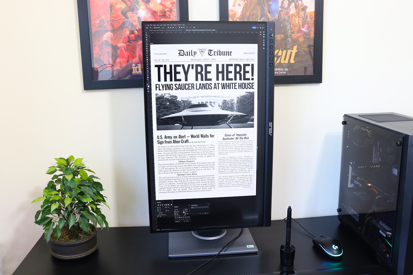
Considering this is Calman Verified at the factory, I’m not sure that you’d need or want to adjust things. Although, if you do, there certainly are plenty of options available. As someone sensitive to both screen flicker and harsh light, I really love the adjustable Low Blue Light and flicker-free features – ideal for deadlines and burning the creative midnight oil.
I did notice that this monitor has a relatively low static contrast level of 1000:1. The contrast levels are dynamic, though. In a darkened room the IPS panel and backlight performed well enough for me but prevented the kind of inky blacks you’d see on an OLED screen. That said, working in a regular home office environment posed no problem during the day or evening. I found viewing angles excellent, too, thanks to the anti-glare coating that diffuses light and reflections very well.
On-screen ruler and bezel ruler
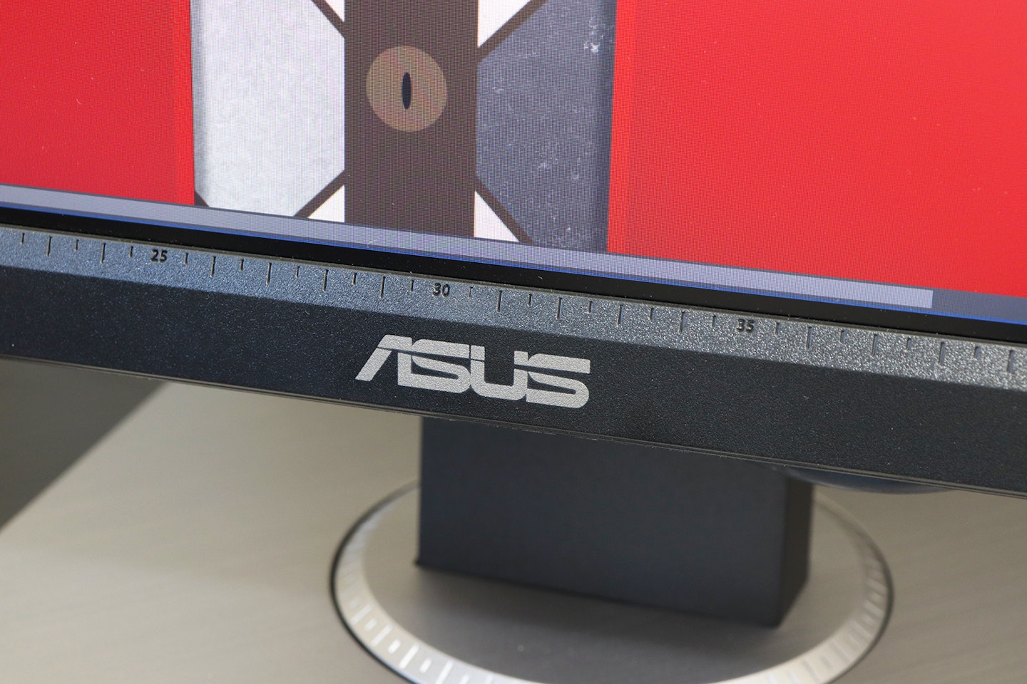
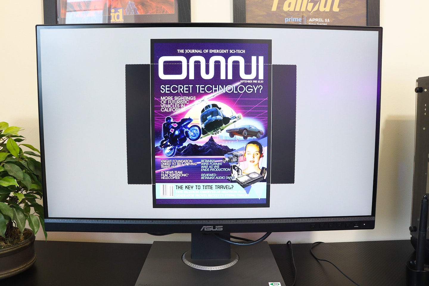
With other monitors, I’ve lost count of the times I’ve held a tape measure up to the screen to check the scale. Having exported your design, it’s handy to double-check how it will look at a 1:1 scale without having to open it in an application with rulers. As a rough and ready method, there are notches every 5mm on the lower edge of the bezel itself – the simplest way to scale things at a glance. If you want more accuracy, there’s a ‘QuickFit’ feature in the menu that overlays rulers of various kinds, proving that you can't get better than a QuickFit monitor.

Any downsides?
It came as no surprise to me to hear that the onboard speakers are tinny. Monitors are increasingly thin and lightweight. Serious speakers with excellent frequency response and a ton of bass are rarely the right size and shape to fit inside. This monitor doesn’t claim to excel at anything other than displaying accurately, so for anyone thinking it’ll be fine as an editing audio monitor – use headphones via the jack, or invest in some of the best speakers for PCs.
On the subject of audio jacks, unlike the side-facing rear USB ports, I found the 3.5mm input and headphone ports a little fiddly to find. They’re tucked a third of the way up the back panel of the monitor alongside the HDMI and other inputs. Considering you’re likely to need to reach around and plug/unplug your headset, it’s a shame they’re not to one side with the USB ports. Plus, the cable management hole in the stand is too low down to keep cables out of sight if the monitor is raised, so I wish ASUS had included clips higher up on the back of it instead.
Lastly, I like that this monitor has Adaptive Sync support so that gamers and media fans can have a stutter-free experience on such a wonderfully colour-accurate display, but its appeal for high-end high-framerate and 4K entertainment is limited by its 75Hz refresh rate and QHD resolution. On that basis alone, it may not be one of the best monitors for PC gaming, but it is fine for gamers who don’t care about 4K at 120fps. That said, this is a ProArt monitor after all – any limitations here are just nitpicks. Yes, 4K would be nice, but not all of us need it – at this price, Quad-HD is more than generous.
Price and competition
I really admire this product for its technical specs and colour accreditations – even more so at this price point. Unusually for any product, it successfully delivers on two traditionally opposing fronts: For many, it qualifies as a great budget monitor, but it’s also a high-end choice for designers and creatives who need accuracy.
There aren’t actually that many brands that cater to this niche. Those that do often have products that aren’t as well designed or specified as this one. But, BENQ and Viewsonic are two brands that are right up there alongside ASUS for monitors that really deliver for creatives.
I really like the BenQ PD2705Q 27-inch monitor – it has the same overall specification as the ASUS and, right now, has a similar price tag. But, it also incorporates a KVM switch for controlling two systems using just this monitor and an attached keyboard and mouse. It also has USB-C ideal for daisy-chaining monitors and power delivery. However, it’s not as bright as the ASUS, is only 65Hz and doesn’t come with Adaptive Sync.
Elsewhere, Viewsonic is a great choice too with two varieties of its VP27 lineup. The Viewsonic VP2768a is almost identical to the ASUS in terms of specs but comes with USB-C and swaps Calman for Pantone verification. And lastly, if you’re looking for the same monitor but in 4K resolution, the ViewSonic VP2768a-4K monitor gives you just that – but it does cost a lot more.
Who is it for?
It’s for any print designer who needs an accurate on-screen colour rendition or any photographer or videographer who needs to process their shots with accuracy. While print professionals might want to look for a monitor with Pantone Validation (as it’s certified by Pantone as being accurate to printed ink swatches) Calman is more widely used as it straddles both digital and print accuracy in its colour gamut. If you’d like to know more, BENQ has a guide to Calman Verified and Pantone Validated certifications.
It might not suit gamers who want to combine the colour response of this screen with their high-framerate gaming, but otherwise, it’s a bit of a hybrid: A high-end colour-certified monitor for creatives and a budget-friendly 27-inch option for everyone else. I think that the ASUS ProArt Display PA278QV is also a fantastic candidate for a dual-monitor setup. The thin bezel and generous stand adjustments mean they can be well-positioned for comfortable viewing without the need for a riser or stand.
Would we recommend it?
Having spent plenty of time working with it, I wouldn’t hesitate to recommend the ASUS ProArt Display PA278QV monitor to anyone – not just creative types. It’s easy on the eye (both in its design and finish and low blue-light and flicker-free tech) and has a lot of tweaks for anyone who likes to fine-tune things away from the Calman factory settings.
What I really loved about this monitor is the small but extremely useful set of special features baked into its design and build. Any designer who ever wanted to quickly check the 1:1 size of a print design can, at a glance, use the notches built into the bezel, or turn on the integrated QuickFit ruler. Add to that the easily found ProArt modes that optimise the display to match what you’re working on, and I think this display really does extend the creative’s toolkit. It also has some great stand adjustments that make sharing your work around the desk or working in portrait a breeze.
More items to consider
This model from ViewSonic is almost identical, pound for pound and spec for spec, to the ASUS. It does have Pantone rather than Calman certification, however. If you’re on a really tight budget and don’t mind dropping to Full-HD resolution and any validations, the KOORUI 27N1 Monitor we reviewed has a 99% sRGB colour gamut, and it’s a steal.
I think that this monitor from BenQ is a great alternative to the ASUS, as it comes with a built-in KVM switch and also has USB-C. However, it does sacrifice some brightness and refresh rate along the way.
Viewsonic has added 4K resolution to the previous 27-inch model in the range, but you’ll pay more than £150 for the privilege.
Who tested it?
Chris Duffill is one of the writers at What’s The Best who specialises in audiovisual technology. He’s previously worked as a professional designer and videographer. Alongside extensive experience using various displays for creative work, he’s designed artwork for digital use as well as print. He’s also shot and edited productions at 4K requiring extensive colour grading. He prefers a flatscreen dual-monitor setup over curved displays for this kind of work.
How the product was tested
I tested the ASUS ProArt Display PA278QV Professional Monitor for over a week, working on graphic designs in Adobe Photoshop, video editing and colour grading in DaVinci Resolve, and photo processing in Lightroom with shots taken in RAW format with my Canon DSLR. I also used the monitor for websites and streaming media, testing the audio input and headphone output.
Why should you trust us?
At What’s The Best, our mission is to provide accurate and reliable reviews, ensuring our readers receive honest and transparent information about the best technology products available. Anything less would undermine our commitment to being a trusted source of unbiased product information.
Our dedicated in-house writing team comprises experts with extensive experience and a genuine passion for technology. Collectively, we have spent decades testing and writing about tech, leveraging our expertise in all our articles, advice pieces and reviews.
We maintain complete editorial independence and do not accept payment for product reviews. Our writers have full control over their content, ensuring that products are selected based solely on the needs of our readers. While we may earn commissions or other compensation from links on our website, this never affects our product choices. These links enable us to continue offering valuable consumer advice, without compromising the integrity of our reviews.
How we test products at What's The Best
Real people, real reviews and trusted buying advice.
Tired of confusing tech reviews? At What's The Best, we cut through the jargon with down-to-earth product evaluations. Our team of experienced reviewers puts everyday gadgets to the test, using them just like you would. We don't waste time on unrealistic scenarios; instead, we focus on real-world performance that matters to consumers.
This means unbiased buying advice you can trust. We only review products that are significant and relevant, so you can be sure you're getting the latest insights. Haven't seen a review for what you're looking for? Don't worry, we're constantly adding new products to our growing catalogue.
For in-depth details on our testing process, visit our dedicated tech and electronics how we test page.
Chris Duffill is a Senior Tech Writer and Reviewer for What's The Best. His background includes writing, editorial, marketing, design, video production and photography.
He specialises in home entertainment and audiovisual tech, including speakers, amplifiers, turntables, streaming media players, and TVs. He is also one of our resident experts in computing (PCs, tablets, smartphones, smartwatches), DSLR photography and all kinds of digital cameras. He also writes about retro gaming, game consoles and various electronic gadgets. If it plugs in, lights up or makes a noise, he’ll write about it.
Subscribe to the What’s The Best Newsletter to keep up to date with more of the latest reviews and recommendations from the rest of the What’s The Best team.
